10 Effective Membership Retention Strategies

Since running a number of membership sites in the past and presently, I want to share with you the most effective membership retention strategies that work time and time again for retaining members.

membership-685021_1280Knowing firsthand how important attracting new members is, retaining them in your member community is the next most important valuable skill you can learn as a membership admin.

So let’s go through each one and these are in no specific order.

Here are ten of my favorites.

Each one is just as important as the next, just consider applying as many as you can.

1. Members Only Facebook Group

This is an idea we are seeing more and more. Let’s say you offer a product and want to build your own tribe. One way is to start a Facebook Group. It’s free to set up and you can create your own FB Group rules. Invite your members to join as a bonus to the membership they have just joined.

Once you have members at Facebook, you can keep in touch with them and get them involved with related topics. Members can interact with each other and you can continually send updates as well as new special offers for members only.

Another thing is most people are already members of Facebook, so it’s very popular and easy to join groups there.

2. Members Only Private Forum

A members only private forum is where you create your own site on your own server. It’s software based so you house your membership community yourself.

In this format, you have full control of your members. Here’s a fact that falls in favor of having a proprietary membership site over a Facebook Group,  and that is, there are some people who do not like participating on Facebook in a membership setting.

They prefer a more private and exclusive setting for member interaction. However, all the same benefits for the members that keep them coming back applies and even more.

There are things like drip feeding content and locked content settings that helps you can keep member’s interested. And you can do things like that much easier using dedicated forum software.

The reality is that most members find it easy to leave a membership site, but harder to leave a community.

3. Member Monthly Webinars

This is a great retention strategy and probably my favorite. Monthly webinars for members-only create one of the most exclusive benefits of keeping members on board.

And here’s why.

They get insider information from you and they expect it each month and it ties in great for having a membership site, so make sure not to leave this one out.

4. Expert Interviews

Here’s something I found that draws a lot of member attention.

I find experts to interview and offer the recordings to my members. You could actually sell these interviews but instead give them to your members as they’ll know the value they carry. And when you give them member-access, it will keep them wanting more.

5. Email Recaps

Not enough membership sites take advantage of this one, but they should.

The reason is because their members will be responsive to it. Using email recaps is a great way to round up interest from your members. Let’s say you just had a member event and you want to get some feedback from members.

An email recap will alert those that missed it and remind those that saw it but are glad to be reminded. And you’ll see a nice flurry of member visits back at the member site on that topic. I find this works effectively every time. Try it.

6. Event Discounts

Having events for your members will always perk them up. Be sure to prepare some nice perks for them from time to time. A great idea that never fails is event discounts. When you can allow members to save them money on something related to their topic that has high-value, they really will appreciate it.

You could arrange a product discount with another vendor exclusively available only at your event. This will go a long way at keeping your members happy.

7. Future Content Teasers

You know what cliff-hangers are in movie trailers, right? It’s when you are watching the highlights and then just as you are drawn-in the most, they stop it there and tell you when and where to expect to see the rest of the show coming soon.

Well, in the membership site world you can do exactly the same with your content and it will have the exact same effect. Announce what you have coming then leave a cliff-hanger at the end of your announcement. This will ensure your members want to see the rest soon as it’s available and you can use this strategy as future content teasers.

8. Quick Start Videos

If you want to keep your members motivated to learn what you are teaching them, you must remember that there are various levels of members at any one time in your membership site. Some are newbies, some are intermediate and some are advanced.

By using quick start videos you can be sure that you have covered all levels of your members. This way, no one feels left behind in getting started on a new task they want to get under their belts. These are easily digestible videos that kick-start learning and really help keep the member interest level high.

9. Mastermind Groups

Forming mastermind groups within your membership site offers a real boost to members. When you form these special groups, the members begin to communicate between themselves helping each other out and offering solutions and trade off their experiences, etc.

This creates a deeper level of loyalty to the membership site overall because they feel so much more a part of it. You as the administrator can moderate and oversell the mastermind groups as much as you see fit, but having them in your membership site will for sure make for an effective retention strategy.

10. Case Studies

If you want to boost or attract a level of extra member interest, adding occasional case studies on topic will surely be draw them in. Every day, new paid products being offered are packaged case studies. When you offer these for members-only your membership site interest will soar.

I hope you took some notes and will use some of these 10 effective membership strategies I just laid out for you. When you do, I’m sure you agree they’ll help keep your membership site going long-term and evergreen.

Comments?

Gauher


Try These Creative Tactics From Proven Sales Funnels

As I wrote in a previous post, one of the best steps you can take to ensure your paid traffic converts is to study and analyze the marketing funnels of competitors.

Their ads, their landing pages, the copy in their emails — all of these represent data points you can use to optimize your own conversions and make money in that market.

I’ll take that advice a step further today and delve into the sales funnels of various companies across multiple industries.

This will uncover some ideas you might not have considered but could be applied directly to your own funnels.

Of course, this exercise is no substitute for a full analysis of your own competitors — it’s up to you to find what messages resonate in your own market.

Still, it always helps to see what other successful businesses are doing. Here are five great ideas I found by analyzing the sales funnels of successful companies.


Kaplan: Segmenting Informational, Navigational and Transactional Queries on Google’s SERPs Page

For-profit school Kaplan University is in one of the most competitive and profitable evergreen markets out there: Education. Having a tight sales funnel is crucial for Kaplan and its primary competitors.

Because the school has sufficient name recognition, it can get creative with its organic traffic.

If you search “Kaplan University” by name, the school owns the first organic result and the first paid result in Google:

Swipe These Creative Tactics From Proven Sales Funnels

The URLs look the same, but the landing pages are different. The paid results actually deliver users straight to a landing page with a three-step opt-in form designed to get them in touch with a representative.

The organic results take users to Kaplan’s home page and the site’s main subpages.

The difference gets right at the heart of user intent, or what a user fundamentally wants when typing in a keyword.

Most marketers break user intent into three categories:

  • Informational (“Tell me more about Kaplan”)
  • Navigational (“I want to go to Kaplan’s homepage”)
  • Transactional (“I want to sign up for classes”)

Searching for “Kaplan University” could indicate any of those three intents; there is no way of knowing. So, what Kaplan had to do for this keyword was target each intent.

The strength of the school’s brand and its other SEO work ensures that it ranks No. 1 for its own name and at the top of the Google SERPs for relevant keywords such as “online colleges.”

That leaves room for experimentation within the crowded set of paid results, where Kaplan can speak directly to users with a transactional intent behind their searches.

Notice the direct appeals in the paid search results’ copy: “Try our classes,” “Find the program for you,” “Transfer your credits.” That action orientation speaks to users with transactional intent.

Then, those users would ideally click through to what is a pretty simple landing page:

Swipe These Creative Tactics From Proven Sales Funnels

The copy reminds visitors of the three-week trial period — as the ad copy featured — and the only actions a user can really take are to fill out the form, get on the phone, or bounce. I would be curious to know how well this converts.

The takeaway: If you have built up brand recognition and people search for your business by name, consider experimenting with segmented user intentions right on Google’s SERPs page.

Let the “Tell Me More” users move into the top of your funnel via the organic results, but speak to your warmer leads with actionable copy and an optimized landing page in a paid search result.


Sendy’s Unsubscribe Page

Sendy’s self-hosted newsletter software creates a competitive offer for price-conscious customers — the company is very upfront about its service being 100x cheaper than competitors such as MailChimp or Campaign Monitor.

This positioning also lets Sendy get away with a bit more cheekiness than others might.

Case in point: When you unsubscribe from a newsletter sent out via Sendy, the publisher can set up the following unsubscribe page:

Swipe These Creative Tactics From Proven Sales Funnels

The first time I saw this, I actually laughed.

That CTA is so ridiculous that it doesn’t even feel pushy.

And that’s kind of the point, isn’t it? Most of us would be left with one of two options here: Either re-subscribe, or get a nice laugh out of the otherwise dull task of unsubscribing from a newsletter you don’t read.

That second outcome still provides a benefit to the sender.

If your last experience with a brand’s sales funnel is humor, you’re likely to leave that relationship on a high note, and perhaps with an elevated perception of the sender.

Later, if you circle back into that company’s orbit, you’re going to bring that elevated brand perception with you into that relationship.

Sendy has set its customers up with a nice win-win here.

The takeaway: Swipe this idea for your own email unsubscribes if (and only if) you feel your brand can get away with this kind of playfulness.


Uber’s Promotions to Existing Customers

On-demand ride service Uber gets a lot of flak.

Taxi drivers have held organized protests against the company.

It’s been shut out of some markets.

It’s got doubters out there who simply wish to “remain unconverted.”

But none of that filters into the company’s touch points with existing customers. In fact, when you look at the promotional email local Uber teams sent out to customers the first weekend of May, everything is literally flowers and sunshine.

Here is the CTA from the promo for Chicago customers:

Swipe These Creative Tactics From Proven Sales Funnels

This email offer is deceptively enticing. At first blush, there is no real benefit to the customer — they don’t get free rides themselves for sharing the code.

But then you return to Uber’s external realities: How many of those customers have “I prefer to remain unconverted” friends who insist on hailing a taxi?

That friend gets a promo code, for sure.

For the less cynical Uber evangelists, the metaphor of planting flowers and watching them bloom might resonate with a desire to simply help other people.

Those Chicago customers were enjoying a sunny 72-degree day when that email went out. It’s easy to tap into someone’s philanthropic nature on such a nice day.

The takeaway: The bottom of the sales funnel isn’t the moment the prospect converts to a customer. The funnel still has a wide base upon which you should build up trust and loyalty among existing customers.

Reach out to them, and appeal to their better natures. If you’re lucky enough to have a core of evangelist customers, give them a reason to evangelize.


AdRoll Gets Incredibly Meta With a Retargeting Campaign

Retargeting platform AdRoll blogged in 2013 about its own success with a Facebook retargeting campaign that saw a 45% increase in conversions and a lot of positive press for the company.

“For many prospective advertisers, the most important thing for them to know is that our platform works for companies just like theirs,” AdRoll’s Tom Pitt wrote.

“Because we work with many tremendously innovative companies, we decided to test a retargeting campaign that highlighted some of those companies and their experience using our product.”

The first ads the company used in this retargeting campaign featured testimonials, which converted at a pretty low rate but brought in high-quality traffic when they did convert.

Shortly thereafter, the company tried an experimental ad on Facebook’s network. Here is one of its promoted posts:

Swipe These Creative Tactics From Proven Sales Funnels

The sidebar ads themselves featured a headline that just read “We’re Retargeting You.”

Such great stuff here. People began screenshotting the ads and Tweeting them out to AdRoll just to say, basically, “Thanks for the laugh.”

More importantly, Pitt said those ads converted 45% better than the control, and soon Facebook retargeting campaigns emerged as a key driver of AdRoll traffic.

The takeaway: Don’t copy this campaign wholesale. People will recognize it.

But do feel free to knock down that fourth wall if you have a savvy audience that would appreciate being in on the joke. If done well, you can get your message out and build up some goodwill in the process.


Retargeting, Take 2: Caviar

Caviar, a mobile service that lets you order delivery food from nearby restaurants, came up in my research for this post, but nothing in particular stood out about the company’s sales funnel.

At least not initially.

Two days later, I was reading some news when I saw this ad:

Swipe These Creative Tactics From Proven Sales Funnels

As with the AdRoll example above, this is an excellent way to be blatant about the retargeting message while keeping the message itself on point.

This also demonstrates how you don’t need to be too meta or tongue-in-cheek with a clever retargeting message.

Now, if only Caviar could retarget me with an image of a specific dish I had previously clicked on.

The takeaway: Retargeting has proved so effective in recent years for the same reason as the Kaplan example earlier — it can get right at the heart of user intent.

Consider what AdRoll CMO Adam Berke told VentureBeat in December: “When you combine this hyper-valuable data set with advanced media buying technology, algorithmic bidding, dynamic creative, and reach across publishers and channels, you end up with an extremely important marketing channel that is now viewed to be as crucial as search engine marketing.”

Comments?

Gauher Chaudhry


Low-Converting Landing Page? Test These 17 Things Right Now

There is now a mountain of evidence that proves we don’t know as much as we thought we did about conversion optimization.

Our guts and opinions give us plenty of ideas, but they are informed by their own biases.

Fortunately, it is relatively simple to validate any hunches that come from your intuition. It’s just a matter of recognizing that your own ideas are mere hypotheses, and a variety of tools exist to test those hypotheses.

That, in essence, is what A/B testing a landing page is — a science experiment.

Below are 17 elements on your landing page you can split test right now to validate whether they’re working. Once you get real-life feedback on your landing page and make the necessary adjustments, conversions will follow.


Test Your Headline

Let’s start this list with a classic from Signal v. Noise.

Back in 2009, when Highrise was just a couple of years old, the 37signals team ran a series of tests on the app’s landing page, targeting the header and the subhead.

Five variations of each were written, and the 25 permutations were shown to 4,000 site visitors each.

This was the control, and it performed the worst:

“Start a Highrise Account
Pay as you go. 30-day free trial on accounts. No hidden fees.”

The winner beat that one with 30% higher conversions:

“30-Day Free Trial on Accounts
Sign-up takes less than 60 seconds. Pick a plan to get started!”

We can use our 20/20 hindsight vision to perhaps figure out why one beat out the other, but that’s missing the point: Test a variety of headlines, and you’ll know for sure which works rather than have a more-informed gut feeling.


Test the Style of Your Copy

Kevin Holesh at Smashing Magazine also recommends testing h1, h2 and h3 copy, especially if this is your first A/B test because it’s such low-hanging fruit.

If you’re ready to get more comprehensive in your testing, though, he points out that the overall style of your copy could use a little scrutiny.

Maybe you’ve got more hype in your copy than necessary, for example. Kevin recommends writing a second version with a different tone and style in mind.

The difference will appear subtle, sure, but the payoff could be huge.


Test the Value Proposition Itself

Sometimes, people find they have a great product or service on its own, and they charge a fair price for it, but still too few visitors convert.

In one landmark case study, the Conversion Rate Experts demonstrated how Crazy Egg’s old landing page was leaking money precisely because it failed to fully communicate the software’s value.

“In order to prove what a bargain it was, we dived into academic research surrounding heatmaps and eye tracking,” which is exactly what Crazy Egg does.

“Though each technology has its champions and detractors, we discovered research from Carnegie Mellon University that indicated an 88 percent correlation between eye movement on a page and subsequent mouse movement in that zone.

“At the same time, we determined that the cost to conduct a formal eye-tracking study can run into six figures and take months to complete.”

This opportunity cost angle was something Crazy Egg’s marketing team had failed to communicate, and it was one of four major tweaks the Conversion Rate Experts crew made to the landing page.

When they were done, the page itself was about 20 times longer than the control, and conversions went up 363%.

If your page isn’t converting as well as you think it should, take a look at how well you sell your offer.

You might have a stronger value proposition than you realize.


Test Your Images

Atlanta-based designer Darren Weik has a number of good examples of conversion optimization through A/B testing on his old Design Toads blog.

Here is one that really stood out.

Logistics company DHL found it got a 15% bump in leads just by swapping out a photo of a male delivery driver with a photo of a female delivery driver.

“The verbiage was exactly the same in both ads, but it was the picture of the woman that generated greater interest,” Darren wrote.

Actually, testing images is its own conversation, but here is one other idea: Test a stock image versus a unique image you created or commissioned.

Think about it. If you use a relevant stock image, you have competitors for whom that image would be similarly relevant. If a site visitor recognizes your photo on a competitor’s site, they are going to experience some cognitive dissonance, at the very least.


Test the Page’s Layout

Low-Converting Landing Page? Test These 17 Things Right Now
 
Forget comprehensive overhauls of your landing page’s layout; even little tweaks can make a big difference.

In one particularly interesting case study, Michael Aagaard at Content Verve got nearly 65% more downloads for an ebook just by shuffling around the placement of his testimonials.

“On the control variant, I placed all four reader testimonials right under the sign-up form,” he wrote. “The idea being that testimonials have most impact when positioned in close vicinity to the call-to-action.

“For the treatment, I decided to place two of the testimonials higher on the page, so they would assume a more prominent position. The idea being that first time visitors who aren’t familiar with ContentVerve.com need an extra nudge, in the form of social proof, to make the right decision.”

His hypothesis was having above-the-fold social proof would reinforce whatever desire the visitor might have to download his free ebook.

It turns out he was right.

Having two testimonials above the fold and two below — while keeping the rest of the layout as it was — resulted in 64.53% more conversions.

The takeaway: If you have information lower on your page that you think might potentially influence action by being up higher, test that hunch.


Test Your Testimonials

To follow up on the note above, it might be worth testing the quality of your testimonials by editing some out.

“I know it can be really hard to be critical of your testimonials,” Joanna Wiebe of Copyhackers says.

“But the cold, hard truth is that, if you want your testimonials to be more effective than simply showing that you have a handful of satisfied users, you should start getting critical with them. Know what you want from a testimonial, and ask your customers for them.”

She goes on to recommend that you never should be shy about asking for a good testimonial. It helps to remind customers and clients that you’ve got a small business, and their words can help.

“…they’ll not only be more likely to give you one – but they’ll also feel really good about doing so,” she says.


Test Your Call to Action

As with images, you could test and refine your CTA eternally.

One thing is almost a guarantee, though: Making your call to action as clear as possible will improve your conversion rate.

Online retailer Fab found this out the hard way, Samantha Mykyte writes at Wishpond.

The company’s control page featured an image of a shopping cart with a plus sign to indicate “Add to Cart.”

As intuitive as that probably sounded to the designer, visitors appeared confused by the meaning of that CTA. Simply changing the wording to “Add to Cart” resulted in a 49% increase, according to Samantha.

When testing your own CTA, try to first identify opportunities to make that action clearer.

Afterward, you can begin to experiment with strange phrasing (“Put this in my cart!”) or even first person vs. second person tests (“Put this in your cart!”).


Even Test the Attributes of Your Button

CRO experts will often make tongue-in-cheek jokes about changing the color of your button, but it’s a hypothesis worth testing.

In April 2015, Inbound.org hosted a big AMA where several conversion optimizers answered questions and talked shop.

The button thing came up a few times.

Oli Gardner offered some good advice, noting that above all your button needs to actually look like a button.

Forest for the trees, right?

Here are some nuanced button attributes Oli noted:

  • “proximity to other elements: what you write close to your button can impact its use
  • surrounding element design: directional cues pointing at a button can make a button appear more buttony
  • clickability: ghost buttons are a massive design trend, and the buttons simply don’t look clickable in the truest sense. Will we train ourselves so this doesn’t matter? Perhaps.
  • interaction: rollover state – is there a strong contrast when you mouseover?
  • interaction: rollover cursor change – does the cursor change to provide feedback based on link conventions?”


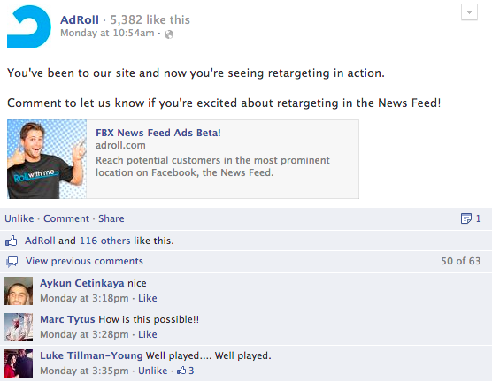
Test Any Social Proof Signals

Low-Converting Landing Page? Test These 17 Things Right Now
 
Derek Halpern from Social Triggers wrote a nice case study for DIYthemes about how social proof actually hurt conversions on one of the site’s opt-in forms.

It sounds counterintuitive, but that’s exactly why we test.

DIYthemes discovered through split testing that removing the phrase “Join 14,752 others and get free updates!” from an email opt-in box actually doubled the number of people who signed up.

“My gut suggests that including a social proof message above the email sign-up form hurts conversions because it interrupts your visitors,” Derek wrote. “Additionally, the social proof may give readers a reason not to subscribe. Even though our numbers are respectable (almost 15,000), that may not be compelling enough for people.”

The lesson here is you should never assume anything. Test, measure and validate instead.


Test the Length of Your Form

Form length has long been one of the best low-hanging fruits of CRO.

The team at MarketingExperiments has a slide deck showcasing some examples of how they’ve boosted conversions just by optimizing the forms on clients’ pages.

One example comes from the website of a luxury home builder that had a call to action requiring visitors to fill out a form for more information.

The control was a button that, when the visitor clicked it, dropped them off at a “Request More Information” form. Lead generation thus required two steps once the visitor decided he or she wanted more information.

The alternative was a simple form in the same spot where the original button was in the right sidebar. The shortened form collected just basic information — first name, last name, email address — and ultimately drove more leads.

“By minimizing friction through reducing the number of steps and fields, the treatment outperformed the control by 166%,” the MarketingExperiments team writes.


Test Inline Validation on Your Form

You would do well to test all the points of frustration a web form can offer.

Case in point: Forms tend to convert better when they give the user feedback during the information input process.

This is called inline validation. You’ll recognize it from online ordering forms, for example, when the form warns you that you’ve entered an incorrect ZIP code or phone number format.

The trick is knowing where and how to employ inline validation, Luke Wroblewski — now a Product Director at Google — wrote at AListApart.com.

It doesn’t make sense to have inline validation on a name field; no one wants a robot judging the spelling of their name.

But maybe validating an email address format could guide users through the form better. Maybe changing the field border from red to green when you create a sufficiently long password is helpful.

Read Wroblewski’s post if you have a complicated form.


Test Whether You Need Your Navigation Menu

Another site that doubled its conversions with one tweak was South African kitchen tools retailer Yuppiechef.com, which Paras Chopra covered in a case study over on the Visual Website Optimizer blog.

The Yuppiechef.com team actually discovered that removing the navigation bar from one of its landing pages upped conversion rates from 3% to 6%.

“Simpler is better,” the team told Paras. “Try [to] assist the user in focusing on their primary objective by eliminating distractions.”

Now, pardon the tired refrain, but do understand why you shouldn’t go out and just remove your nav bars.

For one thing, Yuppiechef.com is a big retailer with lots of navigation options. Its nav bar presents many more choices than “About,” “Blog,” and “Contact.” Perhaps that made a difference.

Either way, it’s important that you test this option. Maybe your page’s visitors respond better to navigation options (or social proof, as in the example above this one).

There is only one way to find out.


Test the Number of Options You Give Visitors, Period


Kerry Butters at Business2Community provides one case study that underscores some of the psychology at work. She notes how server solutions provider Power Admin discovered the selling power of removing choices from potential customers.

“The test basically found that when presented with too many choices, people actually made none and simply left,” Kerry writes. “Power Admin took a look at its own site and decided to apply the principle to its navigation system, which was presented via lots of textual links.”


Try Adding Price Anchors

Let’s get down to the actual act of selling something via your landing page.

One sticking point for many of your otherwise qualified visitors may be your price.

Your visitors might not actually have any clue what a fair price would be for the thing you are selling, but just having a big “$97” at the end of your sales page might still rub them the wrong way.

Price anchoring allows you to put that price into context by offering price tiers.

“In retail stores, obscenely high-priced items (such as a $5,000 handbag) make everything else (such as similar $1,000 handbags) look affordable,” Geoff Austin writes at Selz.com. “Similarly, more $500 shoes will be sold when $1,000 shoes are displayed next to them.”

So, if you’re selling an ecourse, an example Geoff uses in his post, try offering three packages, with the middle package being the one you ultimately want to sell.

Sandwich that package with a cheaper one and a more expensive premium version.

He offers a pricing ratio of 1x, 2.5x and 5x for that three-tiered offers.

So, if you’re selling a $97 ecourse, test a cheaper option at two-fifths the price ($37 would do it), plus a premium package that should be double the primary offer ($197 in this example).


Test Reference Pricing

Amazon and T.J.Maxx have both made a killing for years with this trick.

Reference pricing simply lists what the standard retail value of an item is, then lists what you are charging for it.

“Reference pricing is especially effective at discount stores, where shoppers are already on the lookout for bargains,” Hadley Thompson at Brainy Click writes.

“When a dress price tag says it would have cost $170 at a top retailer but is available for only $85 at TJ Maxx, the effect is to make the shopper think they’ve discovered a tremendous bargain — even if that’s not actually the case.”

Those strikethrough prices on Amazon.com do the same thing, and this is probably the best way for you to communicate a reference price on your own landing page.


Test Freemium Offers vs. Free Trials

There is a subtle difference between offering a free trial and offering a freemium service.

Darrin at Layered Thoughts digs into the psychology in a really great post. The main point is this, he writes:

“With both freemium and free trials, your job is to convince a potential customer that your product is worth paying for.

“With a freemium option, you will be creating your own friction by making your customer treat you like all of their other free services they use, making it hard for you to ultimately convert them.

“With a free trial, you have much more control over the sales process and funnel and can architect everything around the VALUE of your product and the BENEFITS it will bring to your customers (once they sign up).”

So, let’s say you’ve got a software as a service business.

Perhaps you’ve got a freemium offer in which visitors can check out basic features at no cost, save for maybe their email address, but too few basic-tier customers are opting in to the paid service.

You could test a free trial option by giving visitors 7-day access to the whole service, which — as Darrin said — might allow you to really drive home the value your SaaS provides.

I, personally, would be curious to know which approach worked better.

Comments?

Gauher Chaudhry


images by:
Samuel Zeller / Unsplash
Eric Terrade / Unsplash
Elizabeth Lies / Unsplash


How To Start Your Own Health Supplements Business

I consider myself to be a serial entrepreneur and whenever I see a great opportunity to build a business, I go for it.

About 18 months ago, I decided to dive into the health supplements business with two other partners. The reason being is that this is a growing market with a lot of substance to it.

We were able to rocket pass the million dollar mark in sales in our first year and it’s one the fastest growing online opportunities available to anyone online.

And here’s what just some of the trends show us…

vitaminsNutritional supplements have grown from $32 billion in sales in 2012 and are expected to almost double all the way to $60 billion per year by 2021.

Now you may wonder why a nutritional supplements opportunity has caught my interest since we have all known about the natural health field for years.

And that is a great question I want to answer here.

This alone told me to start getting involved. And with ecommerce sales growing at a 20% compounded annual growth rate, it helps us understand how lucrative this market continues to become.

Now let me show you where the pulse of the market is being driven from; 76 million baby boomers who hold 50% or more of the whole USA disposable income.

This market is hungry for solutions to help them through their golden years.

They are buying hundreds of nutritional products every day so they can look and feel younger, improve their skin, lose weight, live heathier and longer as well as pain free.

The list goes on.

This demographic is extremely concerned about the massive costs related to keeping up with their health costs and are looking for healthy alternatives to staying well but with a good quality of life.  This uncertainty of maintaining a good quality of health is what drives the market and is an on-going self-replenishing, evergreen market.

From:

– Weight Loss
– Heart Health
– Cognitive Health
– Joint Health
– Energy
– Digestive Health
– Sports Nutrition
– Immunity
– Protein

And many more as this is only the tip of the iceberg.

Each area of these health solutions can be segmented into various demographics of the market population which gives us numerous opportunities to find success in the nutritional supplement business.

Another point of view I have also noticed from being a traffic expert is this. In the various markets, this trend of buyers is easier to find now with all of the social media sites and outlets we have. We know where they dwell and have many ways to reach them.

This offers a perfect aim for any market you want to target with supplements.

It also sets the stage for building a sellable asset because once you are established, bigger nutritional companies may offer to buy your company. It happens all the time.

Now while you may not want sell your asset, it’s always nice to know that you have a growing business that is accruing and building value along the way.

And here’s one of the most rewarding aspects of owning a nutritional supplement ecommerce business. Your customers will continually reorder the same products over and over plus add new ones on to their monthly orders.

This not only tells you that they appreciate your products and services… but it’s this built-in repeat business that can automate much of your income.  All that said, let me add one more very important observation to keep in mind that helps sustain a supplement business, long-term.

And that is, you do not have to reinvent new wheels or constantly seek out the newest, trendy here-today -gone-tomorrow products.  No, not in the supplement industry, because most of it is built on well-grounded, faithful product selections from the supplements they know, want and trust.

And all you have to do is give them what they are already looking for and you can have a thriving, nutritional, ecommerce business. One that can grow for years because the market is huge and growing so fast, there’s room for new companies to sprout up.

Although we do not sell on the Amazon marketplace, there are hundreds of marketers selling health supplements through an Amazon Seller Central account. It is mind boggling how many health supplements are sold on Amazon every single day.

I hope this post gives you some ideas and insights.

If you want to see more information on the things I touched on and even beyond, then I highly recommend you watch these training videos from Buck Rizvi, who grew his supplement business to $10 million in just 18 months.

Click Here To Watch

These videos will only be available for a limited time.

Comments?

Gauher Chaudhry


10 Quick VSL Hacks That Can Triple Your Sales

There was a time not too long ago when the video sales letter was spoken about with a sort of hushed reverence.

Take your written sales letter, turn it into a video, double your money.

I’m glad that’s done with.

Now, we’re left with something a lot more useful: An understanding that a VSL can convert a nice percentage of targeted leads into customers. If you do it right.

This post is for those of you with a decent VSL that’s almost there, but just needs a nudge in the right direction.

Below are 10 proven hacks that have doubled, tripled, even quintupled sales for others. Some of these can be done with a few clicks. Others involve more substantial changes.

Take them one at a time, testing each as you go.

I’ll be excited to read about your results in the comments.
 

Set Your Video to Autoplay

Ryan Deiss at DigitalMarketer.com — probably one of the best people online for video sales letter tips — broke down 43 split tests he had run on a variety of landing pages, and one thing he discovered sounds a little counterintuitive.

Eighty percent of the time, an autoplay video would beat out videos that users have to click to play.

To many people, autoplay is annoying, right? Maybe we’ve left our speakers on full blast, and the video catches us off guard.

But there is a subtle magic in removing a user’s ability to manually initiate video play.

“A click–to–play video reduces the control you have over your message,” Ryan wrote. “More often than not, click-to-play allows the prospect to procrastinate watching the video… and they never actually watch it.”

If you host your video on YouTube, setting up autoplay is easy. You just have to tweak the HTML in the video’s embed code.

Step 1: On your video’s YouTube page, click “Share,” then click “Embed” to arrive at the screen where you can grab the embed HTML code.
10 Quick VSL Hacks That Can Triple Your Sales

Step 2: Copy the embed code and paste it on your VSL page.
10 Quick VSL Hacks That Can Triple Your Sales

It’s going to look something like this:
iframe width=”853″ height=”480″ src=”[YouTube Video URL]” frameborder=”0″ allowfullscreen

Step 3: Add ?rel=0&autoplay=1 to the code.
Tag it on to the end of the YouTube video URL, inside the quotation mark:
iframe width=”853″ height=”480″ src=”[YouTube Video URL]?rel=0&autoplay=1” frameborder=”0″ allowfullscreen

That’s it. Be sure to test autoplay vs. click-to-play on your own VSL, as one person’s own experience will seldom translate.
 

Hide the Video Controls, Too

Again, this is about limiting the user’s ability to control your message.

If your offer doesn’t resonate with the viewer, the viewer is going to bounce off your page, anyway. If it does resonate, hiding the video controls just removes an unnecessary variable.

There are two ways to hide video controls.

Option 1: Startup consultant Wayne Gilchrist put together a helpful video in 2014 that shows you how to hide the video controls and the video info bar by tweaking the HTML, as before.
Here’s the sample embed code again:
iframe width=”853″ height=”480″ src=”[YouTube Video URL]” frameborder=”0″ allowfullscreen

To remove the controls, add the parameters ?controls=0 to the end of the URL, again inside the quotation mark. This is the new sample embed code:
iframe width=”853″ height=”480″ src=”[YouTube Video URL]?controls=0” frameborder=”0″ allowfullscreen

If you also want to get rid of the info and have a clean video, you can add &showinfo=0 right after the controls parameter. That makes the new code look like this:
iframe width=”853″ height=”480″ src=”[YouTube Video URL]?controls=0&showinfo=0” frameborder=”0″ allowfullscreen

Option 2: That’s the hard way. If you’re into coding fundamentals, it’s a nice trick to know.
For the rest of us, YouTube has recently made this process much easier. Right on Embed screen, you can simply uncheck the boxes that read “Show player controls” and “Show video title and player actions”:

10 Quick VSL Hacks That Can Triple Your Sales

Split test the various combinations here — autoplay, hide controls, and/or hide info — to see whether any one option outperforms the rest.
 

There Are Three Emotional Frameworks for Building Your Script — Choose One

Now, let’s dig a little deeper into your video sales letter’s script.

First, some psychology. Lewis Howes has a video interview with VSL expert James Wedmore in which Wedmore lays out what makes video so powerful from a neurolinguistic programming perspective.

Basically, there are three modalities of learning, Wedmore says: Audio, visual and kinesthetic — that refers to feeling, both in terms of physical touch and emotional feeling.

Videos tap into all three modalities.

“You see the words on the screen, visual; you hear the words; and you FEEL the tonality,” he says.

Let’s address how to set up that kinesthetic modality first. I’ll go over tonality in just a moment.

Vishen Lakhiani at Mindvalley Insights says a script has three available frameworks for really tapping into how your viewer feels.

Option 1: The Open Approach
Project confidence, power and a sense of being influential in your word choice. Position yourself as an expert, talk about what the viewer will learn, and back up what you say with findings and insights.

Option 2: The Emotional Approach
Focus on deep pain points that gnaw at a person’s emotions. “Envision the time you were at your lowest low and what changed your life around: your product,” Lakhiani says.

Option 3: The Anger Approach
This is a classic frame from American politics: Rally the viewers’ anger against some status quo, and speak passionately about why your product or service fights back against that moral wrong.
 

Use This Proven Formula For Sequencing Your Script

After you’ve found your emotional frame, it’s time to write the script from headline to CTA.

This is the single most important aspect of your VSL. Fortunately, MarketingBlogger.com’s David Frey shared his 12-step sales letter formula on MarketingProfs more than a decade ago, and it’s worked thousands of times over.

Seriously, bookmark this page, print it out if you need to, and work through it step by step until you’ve got the first draft of your sales letter.
 

Tell Viewers Right Upfront What They Will Get Out Of Watching Your Video

David’s 12-step sales letter does a good job of explaining this, but you have to be more explicit with a video audience.

You have to tell them — upfront — why they should watch this video that just began to autoplay.

“If you ask the audience for their time, you’ve got to give them something,” says content marketing agency Sumer’s CEO, Michelle Salater.

“To do this, use your VSL to teach something. Begin your script by explaining to the audience that, if they watch the video until the end, they will discover how to improve their lives in some way or another.

“Be brutally candid about the results they’ll get from your strategies. In giving them value up front, you leverage your expertise, and steer them toward the purchase point.”
 

Learn How to Develop an Authoritative Tone

Let’s go back to Wedmore’s point that a viewer needs to feel the tonality from the speaker in the video.

If you are planning to speak on behalf of the product or service you are selling, it’s crucial that you nail that tonality.

The team at UK-based consultancy People Alchemy have a great tutorial on speaking authoritatively, and I want to highlight two points they make.

First, speak with your deeper voice. The deeper resonance a professional speakers has comes from the pharynx (“If you imagine that you are gargling marbles and speaking at the same time, you will get a good approximation,” they write) and the chest itself.

Practice speaking aloud, and feel with your own hand where your voice resonates. If you can relax and let your voice boom from inside your chest, you will sound much better on camera.

Also, watch the ends of your sentences. Americans tend to have a rising inflection at the ends of sentences, which makes even simple declarative statements sound like questions.

Likewise, don’t let the end of your sentence tail off, as if it ran out of momentum before the last three words.
 

Or, Just Hire Out the Voiceover Work

“Good voice-over artists are like good graphic designers — they make your company seem extremely professional,” the team at Conversion Rate Experts noted in a case study they did a few years back.

All other things being equal in a VSL, a professional-sounding voice will outperform a non-professional voiceover 999 times out of 1,000.

Below are just a handful of places where you can hire a voiceover artist in minutes:


Inject Credibility Into Your Video

This goes back to what David Frey wrote in his 12-step sales letter formula: You need to be specific about who you are and why you are a credible source of information.

Longtime internet marketer Jim Edwards has his own 10-step formula for VSLs, and he has three examples of how you can highlight your own credibility:

  • “I’ve got 23+ years’ experience buying and selling investment properties, my own properties and my clients’ properties.”
  • “I spent 10 years as a mortgage broker and realtor, so I know the inside story most people will never tell you.”
  • “I know how the system really works and will pull back the curtain to explain why houses do or don’t sell, and how you can sell your house yourself relatively easily.”


Have a Transcript or At Least a Bullet-Point Summary — In Fact, Test Each One

Finally, it is worth testing to see whether your viewers respond to having the option of simply reading your sales letter.

“I might not watch a video, but I will read a transcript,” Laura Crest at SEO copywriting firm Success Works says.

“And I have converted on sites that have video transcripts, because I have been able to read, and the company in question has given me that option.”

There are two options here, and both can be tested pretty easily.

Option 1: Paste the whole sales script below your video.
If the viewer is interested but not in a position to watch the video (say at work), this gives them the option of hitting pause or turning down their speaker volume, then simply reading what you’ve got to offer.

Now, if you have a long video, this might not look so great

Rule of thumb: 150 written words equals about one minute of video time. If your VSL is 12 minutes long, that’s an 1800-word sales letter. Some products and some markets will accept that; others won’t.

That’s why you should try out an alternative.

Option 2: Distill that script down to bullet points.
“If you don’t want to provide a transcript for whatever reason, consider including a really good, content-rich bullet point summary,” Crest says.

“At least that way, the folks who don’t want to sit through your video have some context, and something to think about. Otherwise, they’re liable to bounce out of your site and not visit it again.”
 

Decrease The File Size of the Video

This one is deceptively obvious — deceptive because so many people never think to do this.

If you have a huge HD video, it might simply load too slowly for some viewers.

“So many times you slap up a video up there and the file size is too big,” IMScalable’s Justin Brooke says.

“So when someone is watching your presentation, they’re having to deal with buffering, or the video quality is not loading correctly, or the load time of the video is so long that they’re leaving before they even watch your video.”

Here are two methods for reducing video sizes in both Windows and Mac using the software that comes standard on those machines.

For Windows users:

  1. Open Windows Movie Maker, and import your video.
  2. Grab your video, and drag it down into the timeline.
  3. Click “Save to my computer,” then designate the file size you prefer in the Save Movie Wizard.

For Mac users:

  1. Open iMovie, and import your video.
  2. Drag your video down into that program’s timeline.
  3. Click “Share,” then click “Export Movie…”
  4. You’ll be prompted to save with specific ratios and quality settings. Adjust those as you see fit, then save your video.

Comments?

Gauher Chaudhry

Lead image by Steve Jurvetson